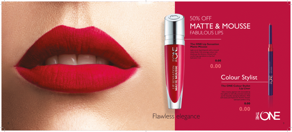
The psychology of color in branding is about understanding how colors generate emotions, influence the perception of a brand, and help connect with the right audience. Choosing the right color palette can make the difference between a visual identity that captivates and one that goes unnoticed.
It’s no coincidence: the world’s biggest brands know that color in branding is much more than aesthetics—it’s a tool for brand communication and persuasion.
Color psychology increases brand recognition by up to 80% and influences the first impression a customer has of your business. It helps convey brand values and brand personality without the need for words.
In my work as a graphic designer, whenever I start a project, I don’t think about shapes or typography first. I think about brand colors. For me, color in design is like the soundtrack of a movie—it completely changes the way we perceive a story. The brand colors I choose for each project are never random: they are the bridge between a brand identity and the people who discover it. And even though guides, theories, and trends exist, the truth is that each project has its own color palette, almost as if it were choosing its own words.
How I choose the perfect palette for your brand:
-
Define the brand’s personality.
-
Research its audience.
-
Analyze the competition.
-
Create balanced combinations.
-
Test on different platforms.