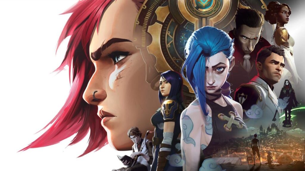
When I first watched Arcane, I didn’t just see an animated series; I saw a visual symphony. As a graphic designer, it felt like watching concept art breathe, each frame meticulously crafted yet alive with energy. I found myself pausing again and again, struck by the fact that almost any still could stand alone as a painting. But what truly fascinated me was not the beauty in itself, but how every visual decision served the story.
From the beginning, I realized that emotion was built into the imagery. The textures were painterly, the brush strokes intentional, the light sculpted to guide feeling. It reminded me of my own creative process: when I start a design, I’m not just chasing form or typography; I’m searching for the emotion that needs to be communicated. In Arcane, that emotion is present everywhere, woven seamlessly into the fabric of the show.
Nowhere is this clearer than in the contrast between Piltover and Zaun. Piltover glows with golden tones, gleaming architecture, and a polished sense of progress. Zaun, by contrast, plunges us into neon greens, heavy purples, and oppressive shadows, immersing us in a world defined by struggle and chaos. Long before a character speaks, the cities tell us who they are. This is color psychology at its most powerful, and it’s a reminder to me of why palette choice is never superficial. In branding, just as in Arcane, color becomes the voice before words.
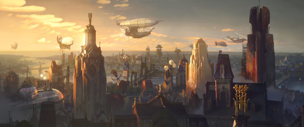
Piltover © Arcane. Created by Christian Linke and Alex Yee. Based on League of Legends from Riot Games
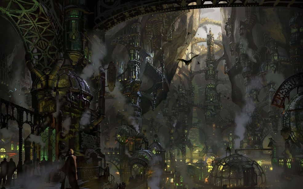
Zaun © Arcane. Created by Christian Linke and Alex Yee. Based on League of Legends from Riot Games
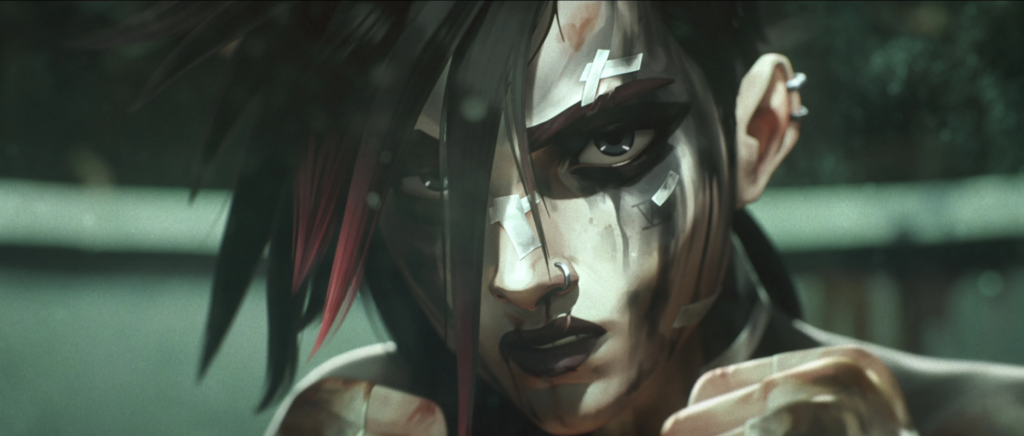
Beyond the bold strokes of color, it was the details that impressed me most. Characters carry expression and nuance without losing their stylized essence. Movement feels cinematic yet always retains the painterly quality that sets the series apart. Even something as subtle as the texture of a wall or a fragment of signage feels considered, adding weight to the world. It reinforced a belief I hold deeply: that great design often goes unnoticed, but its impact is always felt. You may not consciously notice the way a shade shifts or how a stroke of light hits the scene, but you sense it, and that sensation shapes the story.
Watching Arcane became, for me, less about following a plot and more about studying a masterclass in design. It showed me that style should never dominate but should elevate the story. It reminded me that every color is a statement, every detail a whisper that builds into a larger chorus. Most of all, it confirmed that design is not ornamentation—it is storytelling itself.
When I stepped away from the series, I felt inspired, not just as a viewer but as a designer. Arcane reaffirmed why I do what I do: because design has the power to move people without words, to bridge the gap between narrative and audience, to turn visuals into emotions. Few works capture this as brilliantly as Arcane, and for me, it stands as one of the most compelling lessons in the art of visual communication I’ve ever experienced.
Vi © Arcane. Created by Christian Linke and Alex Yee. Based on League of Legends from Riot Games
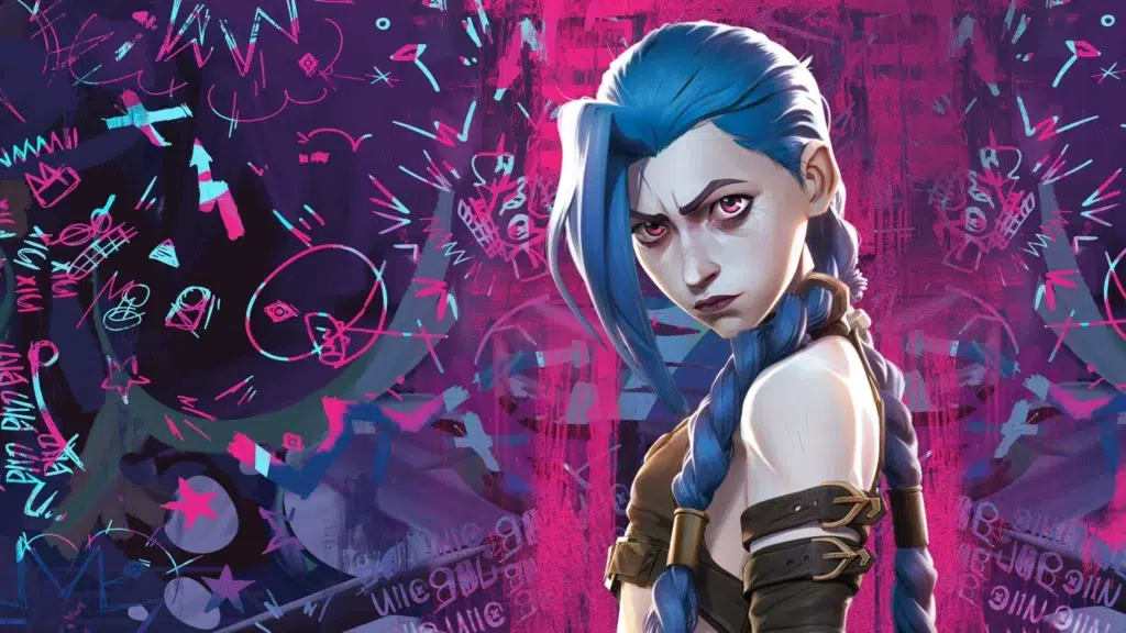
Jinx © Arcane. Created by Christian Linke and Alex Yee. Based on League of Legends from Riot Games